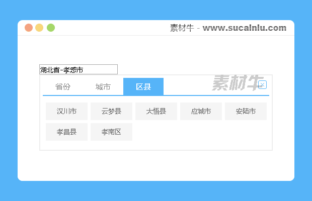
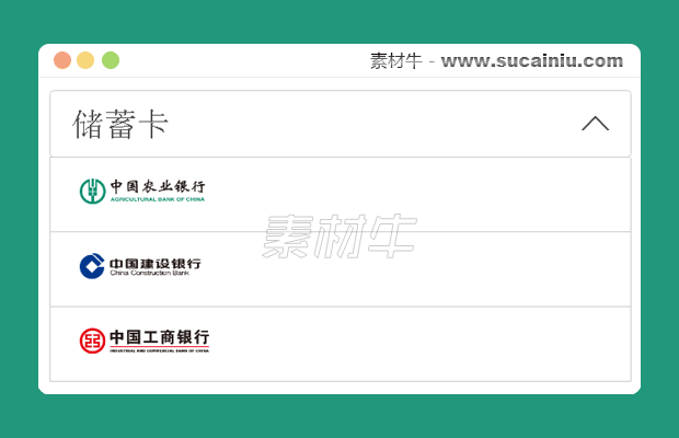
所属分类:网页特效-输入/选择框/联动


@import url(http://fonts.googleapis.com/css?family=Cabin:400);
.webdesigntuts-workshop {
	background: #151515;
	height: 100%;
	position: absolute;
	text-align: center;
	width: 100%;
}
.webdesigntuts-workshop:before,
.webdesigntuts-workshop:after {
	content: '';
	display: block;
	height: 1px;
	left: 50%;
	margin: 0 0 0 -400px;
	position: absolute;
	width: 800px;
}
.webdesigntuts-workshop:before {
	background: #444;
	background: -webkit-linear-gradient(left, #151515, #444, #151515);
	background: -moz-linear-gradient(left, #151515, #444, #151515);
	background: -o-linear-gradient(left, #151515, #444, #151515);
	background: -ms-linear-gradient(left, #151515, #444, #151515);
	background: linear-gradient(left, #151515, #444, #151515);
	top: 192px;
}
.webdesigntuts-workshop:after {
	background: #000;
	background: -webkit-linear-gradient(left, #151515, #000, #151515);
	background: -moz-linear-gradient(left, #151515, #000, #151515);
	background: -o-linear-gradient(left, #151515, #000, #151515);
	background: -ms-linear-gradient(left, #151515, #000, #151515);
	background: linear-gradient(left, #151515, #000, #151515);
	top: 191px;
}
.webdesigntuts-workshop form {
	background: #111;
	background: -webkit-linear-gradient(#1b1b1b, #111);
	background: -moz-linear-gradient(#1b1b1b, #111);
	background: -o-linear-gradient(#1b1b1b, #111);
	background: -ms-linear-gradient(#1b1b1b, #111);
	background: linear-gradient(#1b1b1b, #111);
	border: 1px solid #000;
	border-radius: 5px;
	box-shadow: inset 0 0 0 1px #272727;
	display: inline-block;
	font-size: 0px;
	margin: 150px auto 0;
	padding: 20px;
	position: relative;
	z-index: 1;
}
.webdesigntuts-workshop input {
	background: #222;
	background: -webkit-linear-gradient(#333, #222);
	background: -moz-linear-gradient(#333, #222);
	background: -o-linear-gradient(#333, #222);
	background: -ms-linear-gradient(#333, #222);
	background: linear-gradient(#333, #222);
	border: 1px solid #444;
	border-radius: 5px 0 0 5px;
	box-shadow: 0 2px 0 #000;
	color: #888;
	display: block;
	float: left;
	font-family: 'Cabin', helvetica, arial, sans-serif;
	font-size: 13px;
	font-weight: 400;
	height: 40px;
	margin: 0;
	padding: 0 10px;
	text-shadow: 0 -1px 0 #000;
	width: 200px;
}
.ie .webdesigntuts-workshop input {
	line-height: 40px;
}
.webdesigntuts-workshop input::-webkit-input-placeholder {
   color: #888;
}
.webdesigntuts-workshop input:-moz-placeholder {
   color: #888;
}
.webdesigntuts-workshop input:focus {
	-webkit-animation: glow 800ms ease-out infinite alternate;
	-moz-animation: glow 800ms ease-out infinite alternate;
	-o-animation: glow 800ms ease-out infinite alternate;
	-ms-animation: glow 800ms ease-out infinite alternate;
	animation: glow 800ms ease-out infinite alternate;
	background: #222922;
	background: -webkit-linear-gradient(#333933, #222922);
	background: -moz-linear-gradient(#333933, #222922);
	background: -o-linear-gradient(#333933, #222922);
	background: -ms-linear-gradient(#333933, #222922);
	background: linear-gradient(#333933, #222922);
	border-color: #393;
	box-shadow: 0 0 5px rgba(0,255,0,.2), inset 0 0 5px rgba(0,255,0,.1), 0 2px 0 #000;
	color: #efe;
	outline: none;
}
.webdesigntuts-workshop input:focus::-webkit-input-placeholder {
	color: #efe;
}
.webdesigntuts-workshop input:focus:-moz-placeholder {
	color: #efe;
}
.webdesigntuts-workshop button {
	background: #222;
	background: -webkit-linear-gradient(#333, #222);
	background: -moz-linear-gradient(#333, #222);
	background: -o-linear-gradient(#333, #222);
	background: -ms-linear-gradient(#333, #222);
	background: linear-gradient(#333, #222);
	-webkit-box-sizing: content-box;
	-moz-box-sizing: content-box;
	-o-box-sizing: content-box;
	-ms-box-sizing: content-box;
	box-sizing: content-box;
	border: 1px solid #444;
	border-left-color: #000;
	border-radius: 0 5px 5px 0;
	box-shadow: 0 2px 0 #000;
	color: #fff;
	display: block;
	float: left;
	font-family: 'Cabin', helvetica, arial, sans-serif;
	font-size: 13px;
	font-weight: 400;
	height: 38px;
	line-height: 38px;
	margin: 0;
	padding: 0;
	position: relative;
	text-shadow: 0 -1px 0 #000;
	width: 80px;
}
.webdesigntuts-workshop button:hover,
.webdesigntuts-workshop button:focus {
	background: #292929;
	background: -webkit-linear-gradient(#393939, #292929);
	background: -moz-linear-gradient(#393939, #292929);
	background: -o-linear-gradient(#393939, #292929);
	background: -ms-linear-gradient(#393939, #292929);
	background: linear-gradient(#393939, #292929);
	color: #5f5;
	outline: none;
}
.webdesigntuts-workshop button:active {
	background: #292929;
	background: -webkit-linear-gradient(#393939, #292929);
	background: -moz-linear-gradient(#393939, #292929);
	background: -o-linear-gradient(#393939, #292929);
	background: -ms-linear-gradient(#393939, #292929);
	background: linear-gradient(#393939, #292929);
	box-shadow: 0 1px 0 #000, inset 1px 0 1px #222;
	top: 1px;
}
@-webkit-keyframes glow {
    0% {
		border-color: #393;
		box-shadow: 0 0 5px rgba(0,255,0,.2), inset 0 0 5px rgba(0,255,0,.1), 0 2px 0 #000;
    }
    100% {
		border-color: #6f6;
		box-shadow: 0 0 20px rgba(0,255,0,.6), inset 0 0 10px rgba(0,255,0,.4), 0 2px 0 #000;
    }
}
@-moz-keyframes glow {
    0% {
		border-color: #393;
		box-shadow: 0 0 5px rgba(0,255,0,.2), inset 0 0 5px rgba(0,255,0,.1), 0 2px 0 #000;
    }
    100% {
		border-color: #6f6;
		box-shadow: 0 0 20px rgba(0,255,0,.6), inset 0 0 10px rgba(0,255,0,.4), 0 2px 0 #000;
    }
}
@-o-keyframes glow {
    0% {
		border-color: #393;
		box-shadow: 0 0 5px rgba(0,255,0,.2), inset 0 0 5px rgba(0,255,0,.1), 0 2px 0 #000;
    }
    100% {
		border-color: #6f6;
		box-shadow: 0 0 20px rgba(0,255,0,.6), inset 0 0 10px rgba(0,255,0,.4), 0 2px 0 #000;
    }
}
@-ms-keyframes glow {
    0% {
		border-color: #393;
		box-shadow: 0 0 5px rgba(0,255,0,.2), inset 0 0 5px rgba(0,255,0,.1), 0 2px 0 #000;
    }
    100% {
		border-color: #6f6;
		box-shadow: 0 0 20px rgba(0,255,0,.6), inset 0 0 10px rgba(0,255,0,.4), 0 2px 0 #000;
    }
}
@keyframes glow {
    0% {
		border-color: #393;
		box-shadow: 0 0 5px rgba(0,255,0,.2), inset 0 0 5px rgba(0,255,0,.1), 0 2px 0 #000;
    }
    100% {
		border-color: #6f6;
		box-shadow: 0 0 20px rgba(0,255,0,.6), inset 0 0 10px rgba(0,255,0,.4), 0 2px 0 #000;
    }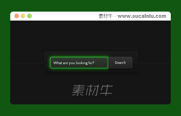
}<section class="webdesigntuts-workshop">
<form action="" method="">
<input type="search" placeholder="What are you looking for?">
<button>Search</button>
</form>
</section> 鄂公网安备 42090202000075号 - 鄂ICP备2021002952号-1
 微博登录
微博登录 QQ登录
QQ登录 微信扫码登录