
如何根据设计图单独开发平板app,(使用apiCloud,把网页打包编译成App)
手机版本的设计图宽度是750,我使用rem单位,如下代码,完美适配,只要把对应的宽度/100就可以了,如750px=0.75rem
    <script>
        document.documentElement.style.fontSize = document.documentElement.clientWidth / 7.5 + 'px';
</script>平板设计图的宽度是2048px,按照bootstrap的适配说明平板最大宽度是992px,最小宽度是768px
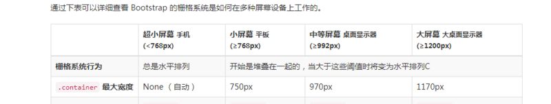
最大宽度是992px,最小宽度是768px的网页中会执行下面的样式,但是平板设计图宽度是2048,怎么换算呢
<!DOCTYPE html>
<html>
<head lang="en">
<meta charset="UTF-8">
<meta name="viewport" content="width=device-width, initial-scale=1, maximum-scale=1, user-scalable=no">
<title></title>
<link rel="stylesheet" href="css/bootstrap.min.css"/>
<link rel="stylesheet" href="css/reset.css"/>
<style>
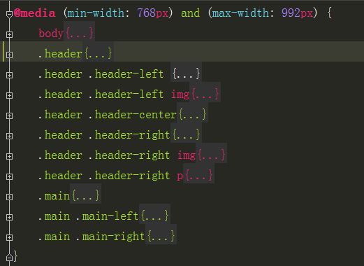
@media (min-width: 768px) and (max-width: 992px) {
body{
font-size: 12px;
}
.header{
display: flex;
height: 0.9rem;
background-color: #fbe80b;
}
.header .header-left {
flex: 0 0 2.05rem;
width: 2.05rem;
}
.header .header-left img{
width: 0.5rem;
height: 0.5rem;
margin-left: 1.45rem;
margin-top: 0.2rem;
border-radius: 50%;
}
.header .header-center{
flex: 1;
text-align: center;
line-height: 0.9rem;
font-size: 24px;
}
.header .header-right{
flex: 0 0 2.05rem;
width: 2.05rem;
}
.header .header-right img{
display: inline-block;
width: 0.26rem;
height: 0.19rem;
margin-top: 0.35rem;
}
.header .header-right p{
display: inline-block;
line-height: 0.9rem;
font-size: 18px;
}
.main{
display: flex;
}
.main .main-left{
flex: 2.85rem;
width: 2.85rem;
border-right: 1px solid #d7d4d4;
}
.main .main-right{
flex: 1;
}
}
</style>
<script>
document.documentElement.style.fontSize = document.documentElement.clientWidth / 7.5 + 'px';
</script>
</head>
<body>
<header class="header">
<div class="header-left">
<img src="images/headerPerson.png" alt="person"/>
</div>
<div class="header-center">课后作业</div>
<div class="header-right">
<img src="images/goDwon.png" alt="goDown"/>
<p>全部科目</p>
</div>
</header>
<section class="main">
<div class="main-left">sfsd</div>
<div class="main-right"></div>
</section>
<script src="js/jquery-1.11.3.js"></script>
<script src="js/bootstrap.min.js"></script>
</body>
</html>
 鄂公网安备 42090202000075号 - 鄂ICP备2021002952号-1
 微博登录
微博登录 QQ登录
QQ登录 微信扫码登录