所属分类:网页特效-选项卡/滑动门
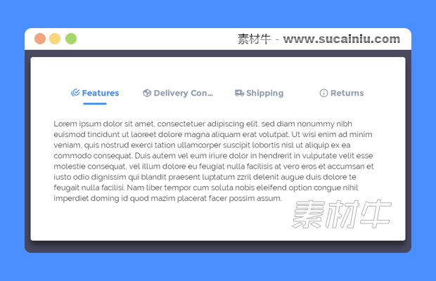


一款使用纯CSS3制作的Tabs选项卡特效。该Tabs选项卡简约时尚,各个选项卡之间切换时使用了下划线跟随动画,整体效果非常不错。
.tabs {
    left: 50 % ; - webkit - transform: translateX( - 50 % );
    transform: translateX( - 50 % );
    position: relative;
    background: white;
    padding: 50px;
    padding - bottom: 80px;
    width: 70 % ;
    height: 250px;
    box - shadow: 0 14px 28px rgba(0, 0, 0, 0.25),
    0 10px 10px rgba(0, 0, 0, 0.22);
    border - radius: 5px;
    min - width: 240px;
}.tabs input[name = "tab-control"] {
    display: none;
}.tabs.content section h2,
.tabs ul li label {
    font - weight: bold;
    font - size: 18px;
    color: #428BFF;
}.tabs ul {
    list - style - type: none;
    padding - left: 0;
    display: -webkit - box;
    display: -webkit - flex;
    display: -ms - flexbox;
    display: flex; - webkit - box - orient: horizontal; - webkit - box - direction: normal; - webkit - flex - direction: row; - ms - flex - direction: row;
    flex - direction: row;
    margin - bottom: 10px; - webkit - box - pack: justify; - webkit - justify - content: space - between; - ms - flex - pack: justify;
    justify - content: space - between; - webkit - box - align: end; - webkit - align - items: flex - end; - ms - flex - align: end;
    align - items: flex - end; - webkit - flex - wrap: wrap; - ms - flex - wrap: wrap;
    flex - wrap: wrap;
}.tabs ul li {
    box - sizing: border - box; - webkit - box - flex: 1; - webkit - flex: 1; - ms - flex: 1;
    flex: 1;
    width: 25 % ;
    padding: 0 10px;
    text - align: center;
}.tabs ul li label { - webkit - transition: all 0.3s ease - in-out;
    transition: all 0.3s ease - in-out;
    color: #929daf;
    padding: 5px auto;
    overflow: hidden;
    text - overflow: ellipsis;
    display: block;
    cursor: pointer; - webkit - transition: all 0.2s ease - in-out;
    transition: all 0.2s ease - in-out;
    white - space: nowrap; - webkit - touch - callout: none; - webkit - user - select: none; - moz - user - select: none; - ms - user - select: none;
    user - select: none;
}.tabs ul li label br {
    display: none;
}.tabs ul li label svg {
    fill: #929daf;
    height: 1.2em;
    vertical - align: bottom;
    margin - right: 0.2em; - webkit - transition: all 0.2s ease - in-out;
    transition: all 0.2s ease - in-out;
}.tabs ul li label: hover,
.tabs ul li label: focus,
.tabs ul li label: active {
    outline: 0;
    color: #bec5cf;
}.tabs ul li label: hover svg,
.tabs ul li label: focus svg,
.tabs ul li label: active svg {
    fill: #bec5cf;
}.tabs.slider {
    position: relative;
    width: 25 % ; - webkit - transition: all 0.33s cubic - bezier(0.38, 0.8, 0.32, 1.07);
    transition: all 0.33s cubic - bezier(0.38, 0.8, 0.32, 1.07);
}.tabs.slider.indicator {
    position: relative;
    width: 50px;
    max - width: 100 % ;
    margin: 0 auto;
    height: 4px;
    background: #428BFF;
    border - radius: 1px;
}.tabs.content {
    margin - top: 30px;
}.tabs.content section {
    display: none; - webkit - animation - name: content;
    animation - name: content; - webkit - animation - direction: normal;
    animation - direction: normal; - webkit - animation - duration: 0.3s;
    animation - duration: 0.3s; - webkit - animation - timing -
    function: ease - in-out;
    animation - timing -
    function: ease - in-out; - webkit - animation - iteration - count: 1;
    animation - iteration - count: 1;
    line - height: 1.4;
}.tabs.content section h2 {
    color: #428BFF;
    display: none;
}.tabs.content section h2: :after {
    content: "";
    position: relative;
    display: block;
    width: 30px;
    height: 3px;
    background: #428BFF;
    margin - top: 5px;
    left: 1px;
}.tabs input[name = "tab-control"] : nth - of - type(1) : checked~ul > li: nth - child(1) > label {
    cursor: default;
    color:
    #428BFF;
}.tabs input[name = "tab-control"] : nth - of - type(1) : checked~ul > li: nth - child(1) > label svg {
    fill: #428BFF;
}@media(max - width: 600px) {.tabs input[name = "tab-control"] : nth - of - type(1) : checked~ul > li: nth - child(1) > label {
        background: rgba(0, 0, 0, 0.08);
    }
}.tabs input[name = "tab-control"] : nth - of - type(1) : checked~.slider { - webkit - transform: translateX(0 % );
    transform: translateX(0 % );
}.tabs input[name = "tab-control"] : nth - of - type(1) : checked~.content > section: nth - child(1) {
    display: block;
}.tabs input[name = "tab-control"] : nth - of - type(2) : checked~ul > li: nth - child(2) > label {
    cursor: default;
    color:
    #428BFF;
}.tabs input[name = "tab-control"] : nth - of - type(2) : checked~ul > li: nth - child(2) > label svg {
    fill: #428BFF;
}@media(max - width: 600px) {.tabs input[name = "tab-control"] : nth - of - type(2) : checked~ul > li: nth - child(2) > label {
        background: rgba(0, 0, 0, 0.08);
    }
}.tabs input[name = "tab-control"] : nth - of - type(2) : checked~.slider { - webkit - transform: translateX(100 % );
    transform: translateX(100 % );
}.tabs input[name = "tab-control"] : nth - of - type(2) : checked~.content > section: nth - child(2) {
    display: block;
}.tabs input[name = "tab-control"] : nth - of - type(3) : checked~ul > li: nth - child(3) > label {
    cursor: default;
    color:
    #428BFF;
}.tabs input[name = "tab-control"] : nth - of - type(3) : checked~ul > li: nth - child(3) > label svg {
    fill: #428BFF;
}@media(max - width: 600px) {.tabs input[name = "tab-control"] : nth - of - type(3) : checked~ul > li: nth - child(3) > label {
        background: rgba(0, 0, 0, 0.08);
    }
}.tabs input[name = "tab-control"] : nth - of - type(3) : checked~.slider { - webkit - transform: translateX(200 % );
    transform: translateX(200 % );
}.tabs input[name = "tab-control"] : nth - of - type(3) : checked~.content > section: nth - child(3) {
    display: block;
}.tabs input[name = "tab-control"] : nth - of - type(4) : checked~ul > li: nth - child(4) > label {
    cursor: default;
    color:
    #428BFF;
}.tabs input[name = "tab-control"] : nth - of - type(4) : checked~ul > li: nth - child(4) > label svg {
    fill: #428BFF;
}@media(max - width: 600px) {.tabs input[name = "tab-control"] : nth - of - type(4) : checked~ul > li: nth - child(4) > label {
        background: rgba(0, 0, 0, 0.08);
    }
}.tabs input[name = "tab-control"] : nth - of - type(4) : checked~.slider { - webkit - transform: translateX(300 % );
    transform: translateX(300 % );
}.tabs input[name = "tab-control"] : nth - of - type(4) : checked~.content > section: nth - child(4) {
    display: block;
}@ - webkit - keyframes content {
    from {
        opacity: 0; - webkit - transform: translateY(5 % );
        transform: translateY(5 % );
    }
    to {
        opacity: 1; - webkit - transform: translateY(0 % );
        transform: translateY(0 % );
    }
}@keyframes content {
    from {
        opacity: 0; - webkit - transform: translateY(5 % );
        transform: translateY(5 % );
    }
    to {
        opacity: 1; - webkit - transform: translateY(0 % );
        transform: translateY(0 % );
    }
}@media(max - width: 1000px) {.tabs ul li label {
        white - space: initial;
    }.tabs ul li label br {
        display: initial;
    }.tabs ul li label svg {
        height: 1.5em;
    }
}@media(max - width: 600px) {.tabs ul li label {
        padding: 5px;
        border - radius: 5px;
    }.tabs ul li label span {
        display: none;
    }.tabs.slider {
        display: none;
    }.tabs.content {
        margin - top: 20px;
    }.tabs.content section h2 {
        display: block;
    }
}整个Tabs选项卡的HTML结构分为几个部分:使用<input>元素和一个无序列表来制作导航。
<input type="radio" id="tab1" name="tab-control" checked>
<input type="radio" id="tab2" name="tab-control">
<input type="radio" id="tab3" name="tab-control">
<input type="radio" id="tab4" name="tab-control">
<ul>
  <li title="tab 1"><label for="tab1" role="button"><span>Tab 1</span></label></li>
  <li title="tab 2"><label for="tab2" role="button"><span>Tab 2</span></label></li>
  <li title="tab 3"><label for="tab3" role="button"><span>Tab 3</span></label></li>
  <li title="tab 4"><label for="tab4" role="button"><span>Tab 4</span></label></li>
</ul>
各个选项卡的内容包含在一个<div>元素中。
<div class="content">
  <section>
    <h2>Tab 1 content</h2>
  </section>
  <section>
    <h2>Tab 2 content</h2>
  </section>
  <section>
    <h2>Tab 3 content</h2>
  </section>
  <section>
    <h2>Tab 4 content</h2>
  </section>
</div>
用于制作下划线动画的线条使用一个<div>元素来制作。
<div class="slider"><div class="indicator"></div></div> 鄂公网安备 42090202000075号 - 鄂ICP备2021002952号-1
 微博登录
微博登录 QQ登录
QQ登录 微信扫码登录