
网上看到的代码,有些不理解的地方:
.custom-border{
width:200px;
margin:10px auto;
height:100px;
border:1px solid #333;
background-color:#eee;
padding:10px;
}
.scale-border{
margin:10px auto;
height:100px;
position:relative;
padding:10px;
width: 200px;
}
.border{
-webkit-transform:scale(0.5);
transform:scale(0.5);
position:absolute;
border:1px solid #333;
top:-50%;
right:-50%;
bottom:-50%;
left:-50%;
border-radius: 10px;
background-color:#eee;
}
.content{
position:relative;
z-index:2;
}
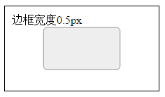
<div class="custom-border border-color">边框宽度1px</div>
<div class="scale-border">
<div class="content">边框宽度0.5px</div>
<div class="border border-color"></div>
</div>请问在这里CSS代码中的
top:-50%;
right:-50%;
bottom:-50%;
left:-50%;
是什么意思?实现这个0.5px的边框的原理是什么?
btw,transform:scale是不是在项目中挺少用到的?百度了好久关于scale 的详细用法甚少。。


是为了放大到原始.scale-border的两倍大小。
因为.border是绝对定位(position:absolute;),所以其定位是根据其最近的非position:static来定的,而.scale-border是相对定位的(position:relative;),所以
top:-50%;
right:-50%;
bottom:-50%;
left:-50%;就是.border以.scale-border的中心为中心,放大到两倍,然后再ransform:scale(0.5);缩小到1/2,那就和.scale-border一样大小了。此时的 1px border,就变为 0.5px。
transform应该可以放心使用。

首先 transform:scale(0.5); 表示缩放1/2的意思,就会变成这样(黑色外边框是特意加上去对比的):
因为对于缩放而言是整体缩小。所以呢,缩小以后,又需要把她拉回原来的大小,这样看起来才像0.5px的边框,即:
top:-50%;
right:-50%;
bottom:-50%;
left:-50%;感觉多加一个 <div> 来表示0.5px的大小,并不优雅,于是改写这样:
.custom-border{
width:200px;
margin:10px auto;
height:100px;
border:1px solid #333;
background-color:#eee;
padding:10px;
}
.scale-border{
margin:10px auto;
height:100px;
position:relative;
padding:10px;
width: 200px;
}
.scale-border::after{
content: ' ';
-webkit-transform:scale(0.5);
transform:scale(0.5);
position:absolute;
border:1px solid #333;
top:-50%;
right:-50%;
bottom:-50%;
left:-50%;
border-radius: 10px;
background-color:#eee;
}
.content{
position:relative;
z-index:2;
}<div class="custom-border border-color">边框宽度1px</div>
<div class="scale-border">
<div class="content">边框宽度0.5px</div>
</div> 鄂公网安备 42090202000075号 - 鄂ICP备2021002952号-1
 微博登录
微博登录 QQ登录
QQ登录 微信扫码登录