
有这样一段HTML:
<span>Repo</span><span>Branch</span>
想要用css绘制出下图的效果:

应该如何写这段CSS?

大概是这么个意思,楼主你看一下:
<!DOCTYPE html>
<html lang="en">
<head>
    <meta charset="UTF-8">
    <title>Title</title>
    <style>
        .shape {
            margin-left: -100px;
        }

        .shape:first-child {
            margin-left: 0;
        }

        .shape span {
            display: inline-block;
            line-height: 100px;
            width: 220px;
            background: #3abf28;
            vertical-align: top;
            color: white;
            font-size: 40px;
            font-family: Arial;
            text-align: center;
        }

        .shape:before {
            display: inline-block;
            content: "";
            border-left: 50px solid rgba(0, 0, 0, 0);
            border-top: 50px solid #3abf28;
            border-bottom: 50px solid #3abf28;
        }

        .shape:after {
            display: inline-block;
            content: "";
            border-left: 50px solid #3abf28;
            border-top: 50px solid rgba(0, 0, 0, 0);
            border-bottom: 50px solid rgba(0, 0, 0, 0);
            border-right: 50px solid rgba(0, 0, 0, 0);
        }
    </style>
</head>
<body>
    <div><span class="shape"><span>Repo</span></span></div>
</body>
</html>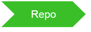

https://jsfiddle.net/hsfzxjy/...
span {
  display: inline-block;
  padding: .5em 1.5em;
  margin-left: 1em;
  position: relative;
  color: white;
  height: 2em;
  box-sizing: border-box;
}

span::before {
  box-sizing: border-box;
  position: absolute;
  content: "";
  border-left: 1em solid transparent;
  border-top: 1em solid;
  border-top-color: inherit;
  border-bottom: 1em solid;
  border-bottom-color: inherit;
  left: -1em;
  top: 0;
  height: 100%;
  width: 1em;
}

span::after {
  box-sizing: border-box;
  position: absolute;
  content: "";
  border-left: 1em solid;
  border-left-color: inherit;
  border-top: 1em solid transparent;
  border-bottom: 1em solid transparent;
  right: -1em;
  top: 0;
  height: 100%;
  width: 1em;
}

#repo {
  background-color: #3ABF28;
  border-color: #3ABF28;
}

#branch {
  background-color: #90E131;
  border-color: #90E131;
}
https://jsfiddle.net/ccchangk...
    <span class="a1">Repo</span><span class="a2">Branch</span>
    <div class="box"><span class="a3">Repo</span><span class="a4">Branch</span></div>
        span {
            position: relative;
            display: inline-block;
            line-height: 30px;
            padding: 0 15px;
            font-size: 10px;
            color: #fff;
        }

        .a1 {
            background-color: #111;
        }

        .a1::before {
            position: absolute;
            z-index: 2;
            content: '';
            border: 15px solid transparent;
            border-left-color: #fff;
            top: 0;
            left: 0;
            /*top: 4px;
            left: -11px;
            width: 21px;
            height: 21px;
            transform: rotate(45deg);*/
        }

        .a1::after {
            position: absolute;
            z-index: 2;
            content: '';
            border: 15px solid transparent;
            border-left-color: #111;
            top: 0;
            right: -30px;
        }

        .a2 {
            background-color: #888;
        }

        .a2::after {
            position: absolute;
            z-index: 2;
            content: '';
            border: 15px solid transparent;
            border-left-color: #888;
            top: 0;
            right: -30px;
        }

        .a3,
        .a4 {
            color: #000;
        }

        .box {
            position: relative;
            width: 150px;
        }

        .box:before {
            position: absolute;
            content: '';
            height: 50%;
            width: 100%;
            background: linear-gradient(90deg, transparent 50%, red 0);
            background-color: #333;
            transform: skew(-45deg);
            top: 50%;
            left: 0;
        }

        .box:after {
            position: absolute;
            content: '';
            height: 50%;
            width: 100%;
            background: linear-gradient(90deg, transparent 50%, red 0);
            background-color: #333;
            transform: skew(45deg);
            top: 0;
            left: 0;
            z-index: -1;
        }
敲了两种,一个是补三角,一个是用了径向渐变和倾斜~
 鄂公网安备 42090202000075号 - 鄂ICP备2021002952号-1
 微博登录
微博登录 QQ登录
QQ登录 微信扫码登录