
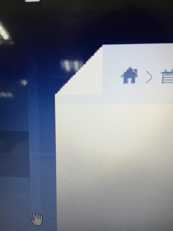
这个效果如何用最简单的办法实现?召唤各位热心大神

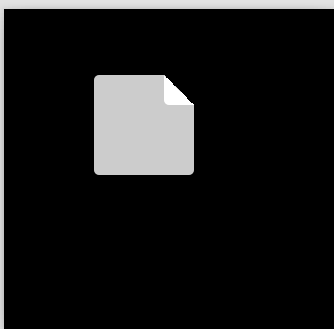
<!DOCTYPE html>
<html>
<head>
    <title></title>
    <style>
        body {
            background: #000;
        }
        .page{
            margin: 100px auto;
            width: 100px;
            height: 100px;
            background: -webkit-linear-gradient(top right,transparent 15% ,#ccc 0);
            position: relative;
            border-radius: 5px;
        }
        .page:after {
            content: "";
            position: absolute;
            width: 30px;
            height: 30px;
            background: -webkit-linear-gradient(top right,transparent 50% ,#fff 0);
            top: 0;
            right: 0;
            border-bottom-left-radius:5px;

        }
    </style>
</head>
<body>
    <div class="page"></div>
</body>
</html>
效果如下

div {
    width: 30px;height: 30px;
    border-left: 30px solid transparent;
    border-top: 30px solid transparent;
    border-right: 30px solid #eee;
    border-bottom: 30px solid #eee; /* 这一条与上一条的 #eee 规定折角颜色 */
    box-sizing: border-box; /* 去除这一条可制作指向右下角的箭头(90 * 90px) */
}<div></div>Chrome 测试通过 - 其它浏览器未测。
这应该是最简单的了。
用类似方法可以造出一共 8 个方向的三角形。可以百度:CSS 三角形。
 鄂公网安备 42090202000075号 - 鄂ICP备2021002952号-1
 微博登录
微博登录 QQ登录
QQ登录 微信扫码登录