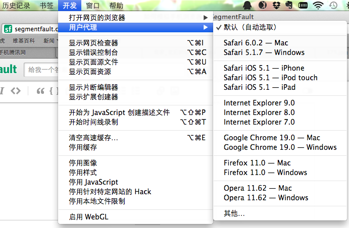
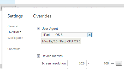
如题,现在搞前端移动开发的是怎么模拟的,用几个FF插件或者Chrome插件吗?
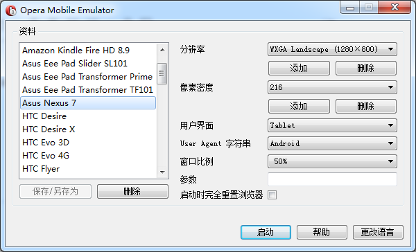
有其它软件模拟不,请推荐几个插件,或者软件的,可能问的不对题,还希望理解

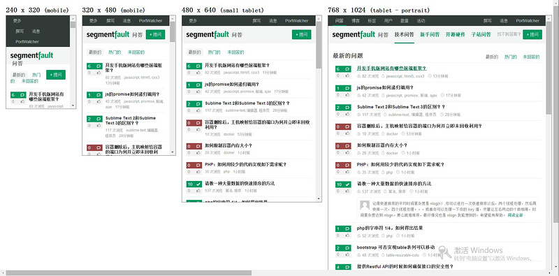
将以下内容添加至浏览器书签:
javascript:document.write('<!DOCTYPE html><html><head><meta charset="utf-8"><title>Responsive Design Testing</title><style>body { margin: 20px; font-family: sans-serif; overflow-x: scroll; }.wrapper { width: 6000px; }.frame { float: left; }h2 { margin: 0 0 5px 0; }iframe { margin: 0 20px 20px 0; border: 1px solid #666; }</style></head><body><div class="wrapper"><div class="frame"><h2>240<span> x 320</span> <small>(mobile)</small></h2><iframe src="' + window.location + '" sandbox="allow-same-origin allow-forms" seamless width="240" height="320"></iframe></div><div class="frame"><h2>320<span> x 480</span> <small>(mobile)</small></h2><iframe src="' + window.location + '" sandbox="allow-same-origin allow-forms" seamless width="320" height="480"></iframe></div><div class="frame"><h2>480<span> x 640</span> <small>(small tablet)</small></h2><iframe src="' + window.location + '" sandbox="allow-same-origin allow-forms" seamless width="480" height="640"></iframe></div><div class="frame"><h2>768<span> x 1024</span> <small>(tablet - portrait)</small></h2><iframe src="' + window.location + '" sandbox="allow-same-origin allow-forms" seamless width="768" height="1024"></iframe></div><div class="frame"><h2>1024<span> x 768</span> <small>(tablet - landscape)</small></h2><iframe src="' + window.location + '" sandbox="allow-same-origin allow-forms" seamless width="1024" height="768"></iframe></div><div class="frame"><h2>1200<span> x 800</span> <small>(desktop)</small></h2><iframe src="' + window.location + '" sandbox="allow-same-origin allow-forms" seamless width="1200" height="800"></iframe></div></div></body></html>')
然后打开需要模拟的网页,点击这个书签,so easy。
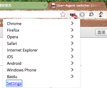
安装这个Chrome Extension
https://chrome.google.com/webstore/detail/user-agent-switcheruserag/ighgcligfbemmpnidpkhikmnmeohfafb


 鄂公网安备 42090202000075号 - 鄂ICP备2021002952号-1
 微博登录
微博登录 QQ登录
QQ登录 微信扫码登录